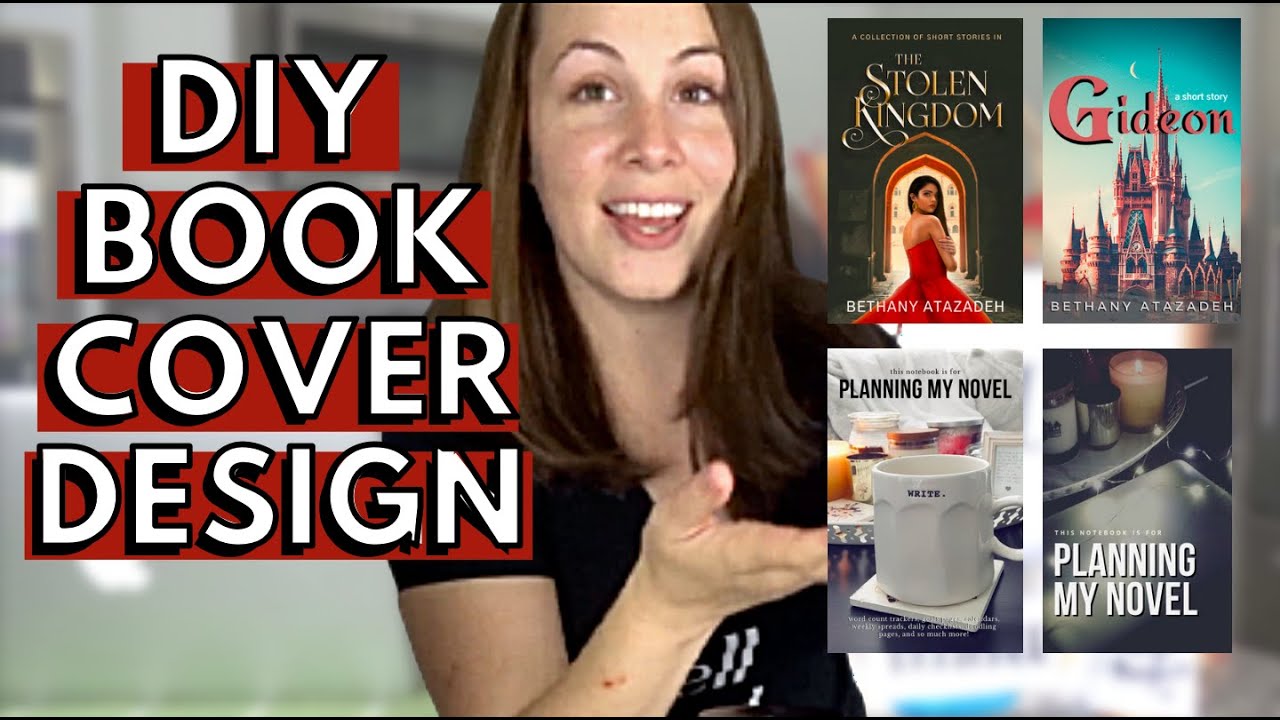
How To Design A Book Cover: Tips for Stunning Visual Impact
Designing a book cover is both an art and a science. It’s the first thing readers see.
So, how do you design a compelling book cover? Creating a book cover involves several steps. You need to think about the genre, the target audience, and the message you want to convey. The cover should capture the essence of the book.
It must be eye-catching yet informative. A good book cover can make the difference between a book being picked up or passed by. In this guide, we will walk you through the process of designing a book cover. We will cover key aspects like choosing the right images, fonts, and colors. Let’s dive into the world of book cover design and make your book stand out!

Credit: litkicks.com
Choosing The Right Colors
Choosing the right colors for your book cover is essential. Colors communicate emotions and set the mood. The right choice can attract readers and convey your book’s essence. Understanding color psychology and matching colors to your genre and tone is vital.
Color Psychology
Colors have different psychological effects. Red often stands for passion, love, or danger. Blue can evoke calmness and trust. Yellow is cheerful and energetic. Green signifies nature and growth. Understanding these effects helps in choosing the right color for your book cover.
Matching Genre And Tone
Genres have specific color schemes. Romance novels often use red or pink. Mystery and thrillers might use dark colors like black or deep blue. Children’s books often use bright, primary colors. Aligning your cover colors with your genre makes the book more appealing to your target audience.
The tone of your book also matters. A serious, dramatic novel might use muted colors. A light-hearted, fun book might use bright, vibrant colors. Ensure your color choice reflects both genre and tone.
Credit: medium.com
Selecting Fonts And Typography
When designing a book cover, selecting the right fonts and typography is crucial. The text should be both attractive and easy to read. The right fonts can set the tone of the book and attract potential readers. Let’s explore how to choose readable fonts and pair them effectively.
Readable Fonts
Fonts must be easy to read. Avoid overly decorative fonts for titles or subtitles. Choose clear, simple fonts that are legible at various sizes. Think about the reader’s experience. Can they read the title from a distance? Test different fonts to see which one works best. Keep readability as the top priority.
Typography Pairing
Pairing fonts can enhance your book cover design. Use one font for the title and another for the subtitle or author name. The fonts should complement each other. Avoid using too many different fonts. Two or three is enough. The goal is to create a harmonious look. Experiment with different combinations. Ensure the fonts work well together.
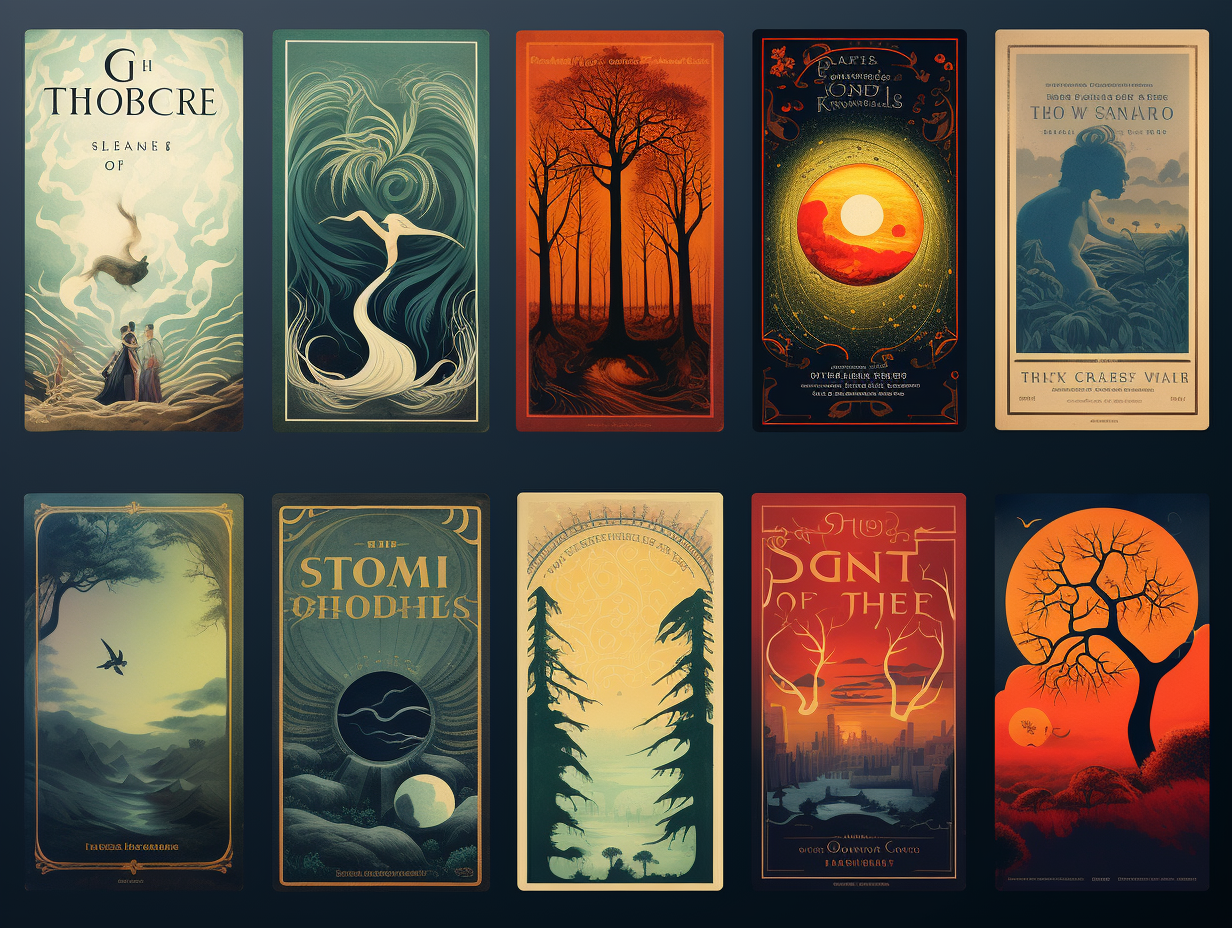
Incorporating Imagery
Incorporating imagery is a key aspect of designing an eye-catching book cover. Imagery can convey the book’s tone, genre, and theme. It grabs potential readers’ attention and gives them a glimpse of the story inside. There are several ways to incorporate imagery effectively. Two popular methods are using illustrations and opting for photography.
Using Illustrations
Illustrations can add a unique touch to your book cover. They offer a way to create a specific mood or highlight important elements of the story. You can work with a professional illustrator to bring your vision to life. Digital illustrations are popular because they allow for easy adjustments and vibrant colors.
Consider the genre when choosing illustrations. A fantasy book might feature magical creatures or enchanted landscapes. A children’s book could have playful and colorful drawings. Ensure the illustrations align with the book’s theme and target audience.
Opting For Photography
Photography can create a powerful visual impact. High-quality photos can convey realism and evoke strong emotions. They can make the book cover appear modern and professional. You can use stock photos or hire a professional photographer for original images.
Select photos that match the book’s tone and genre. A thriller might benefit from dark, mysterious images. A romance novel might use soft, warm photos. Ensure the photos are high resolution to avoid a blurry cover. Properly edited photos can enhance the overall design.
Balancing Elements
Creating a book cover involves balancing various elements. This balance ensures the cover is visually appealing and communicates the book’s essence. Here’s how to achieve that balance.
Visual Hierarchy
Visual hierarchy guides the reader’s eyes. Start with the title. Make it the most prominent element. Use bold fonts and contrasting colors. The subtitle and author’s name should follow. These should be smaller but still readable. Arrange elements to create a natural flow. This helps readers quickly understand the cover.
Spacing And Alignment
Proper spacing and alignment create a clean look. Keep enough space between elements. This prevents clutter. Align text and images neatly. Use grids to maintain consistency. This makes the cover look professional. Avoid overcrowding the cover. Let each element breathe. This enhances readability and appeal.

Credit: jsabooks.net
Frequently Asked Questions
What Are The Key Elements Of A Book Cover?
A book cover should have a title, author name, and an engaging image. These elements attract readers.
How Do Colors Affect Book Cover Design?
Colors set the mood and tone of the book. Bright colors attract attention, while dark colors create mystery.
Should I Hire A Professional For My Book Cover?
Hiring a professional can ensure a high-quality design. They understand trends, printing specs, and visual appeal.
Conclusion
Creating a book cover involves both creativity and strategy. Focus on your genre and audience. Choose colors and fonts wisely. Keep it simple but eye-catching. A good cover grabs attention and reflects the book’s essence. Review and refine your design.
Seek feedback from others. Finally, ensure your cover looks good in different sizes. A compelling cover can make a big difference in attracting readers. Happy designing!


